Fitting height and weight data

(15 pts)
I've got a fun program on my webpage that generates random CSV data for people. You can access it via Python like so:
import pandas as pd
df = pd.read_csv('https://www.marksmath.org/cgi-bin/random_data.csv?username=mark')
df.tail()
| first_name | last_name | age | sex | height | weight | income | activity_level | |
|---|---|---|---|---|---|---|---|---|
| 95 | Frank | Parker | 45 | male | 65.49 | 130.90 | 39050 | high |
| 96 | Clyde | Botti | 43 | male | 74.95 | 156.12 | 1952 | moderate |
| 97 | Donald | Hollack | 31 | male | 67.11 | 206.31 | 44204 | moderate |
| 98 | Cheryl | Hamilton | 23 | female | 65.32 | 188.72 | 86 | none |
| 99 | Doug | Garcia | 23 | male | 68.27 | 148.50 | 722 | high |
Here's the cool thing - the data is randomly generated but the random number generator is seeded using the username query parameter in the URL. Thus, if I execute that command several times, I get the same result every time. That result depends upon the username, however. If you do it with your forum username, you'll get a different result. Thus, we all have our own randomly generated data file!
The problem
This Python assignment comes in several parts:
- Download your own personal CSV and display the tail of that data
(I used the commandprint(df.tail().to_html())to generate code for the table) - Extract and plot the
heightandweightcolumns, - Plot that data with
heighton the horizontal axis andweighton the vertical, - Use Python/Numpy/Scipy to set up and solve the normal equations to find a function of the form $f(x)=ax+b$ that models the data, and
- Plot your function with the data.
You'll turn in the assignment as a response to this post. Of course, collaboration is encouraged - even unavoidable. You should certainly find some helpful code on our class web pages:
Comments
Using
import pandas as pd
import matplotlib.pyplot as plt
import numpy as np
from scipy.linalg import solve, eig
GA = pd.read_csv('https://www.marksmath.org/cgi-bin/random_data.csv?username=gabriel')
GA.tail()
My tail of my data was:
Edit: This isnt the entire data set, I plotted the entire data set, which, when plotted using
import matplotlib.pyplot as pltproduced
I printed the values for height and weight and renamed them in a list H1 and W1, respectively. Edit: I reran the code with the entire data set. This was the new H1 and W1
Using code found in the Least Squares tutorial,
which gave the solution
which roughly corresponds to the equation
$$ y = 1.18x + 89 $$
Using this solution I plugged
The corresponding plot gave
Generating data under the glorious username LordFarquaad resulted in
I then extracted the height and weight columns to their own variables
and plotted them.
plt.plot(height, weight, '.')Now to fit the data to a line $f(x)=ax+b$ by solving $A^TAx=A^Tb$ where matrix $A$ is comprised of the height data and vector $b$ the weight.
The result was
a=1.389714565661591andb=75.88285967631238.And finally plotting the line $f(x)=1.39x+75.9$
displays the closest possible approximation.
@dan
I like your answer the best so far. It's the most complete and presents an analysis using all the data. I do have some comments, though.
It looks like you're trying to use LaTeX at some inappropriate spots.
print(df.tail().to_html())should yield good exactly what you want.#). A simple example. looks like:a = 1
b = 2
a+b
// Out:
// 3
@gabriel and @LordFarquaad
We're interested in all your data - not just five points.
I began this problem by setting up the necessary libraries and retrieving the data.
import pandas as pd import matplotlib.pyplot as plt import numpy as np from scipy.linalg import solve, eig df = pd.read_csv('https://www.marksmath.org/cgi-bin/random_data.csv?username=Donkey') df.tail()This gave the output:
Note that this is not the complete data set, but only the final 5 rows. I then set up vectors containing the height and weight data for the entire data set, then plotted weight vs. height.
Next I set up a matrix using the height values as the first column, with the second column all ones. I then used the Least Squares formula to generate a fit line.
Therefore the equation for the fit line is $\hat{weight} = 0.69(height) + 127.93$. Plotting this line with the original plot gives the following:
I started by importing the necessary libraries, as well as the data:
import pandas as pd import numpy as np from scipy.linalg import solve, eig import matplotlib.pyplot as plt df = pd.read_csv('https://www.marksmath.org/cgi-bin/random_data.csv? username=opie') df.tail()The tail of my data was the following:
Next, I pulled the height and weight from the table, and labeld them H and W, respectively
I then plotted the whole set of the data and found the following
Then, using the Least Squares Formula, I was able to find an equation for the line of best fit:
Thus, we find that our line of best fit for this data is $$y = .6337x + 131.1799.$$
We can then add this line to the earlier plot to get a good visual on what we should expect:
Import libraries, download CSV data and print tail of data;
import pandas as pd import matplotlib.pyplot as plt import numpy as np from scipy.linalg import solve, eig df = pd.read_csv('https://www.marksmath.org/cgi-bin/random_data.csv?username=joshua') df.tail()Extract and plot height and weight columns of data,
Set up and solve the normal equations to find a linear function that models the data,
$$f(x) = ax + b$$
$$a = 1.58265964 \ , \ \ b = 67.31526454$$
$$\boxed{f(x) = (1.58265964)x + (67.31526454)}$$
Plot function with data,
Once upon a time, there was a tabular-formatted collection of data. This table was full of information. Much of that information related to the heights and weights of an (assumed) fictional group of 100 people.
This data was acquired like so:
import pandas as pd def getData(name): path = 'https://www.marksmath.org/cgi-bin/random_data.csv?username=' + name return pd.read_csv(path) df = getData('ben')The tail of that data-table looked like this:
print(df.tail().to_html())This data raises many important questions, such as "Is there a direct, linear correlation between sampled heights and weights?", and "Why is Fred Powell female?". The first question can be addressed through a least-squares solution. The latter we leave as an exercise for the reader.
To find a linear best fit, we first setup our environment:
and generate a quick plot of our data (using matplotlib.pyplot):
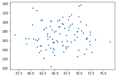
xs = df.height ys = df.weight plt.xlabel('Height') plt.ylabel('Weight') plt.suptitle('Subject Height vs. Weight') plt.plot(xs,ys, '.') plt.show()Once the data is visually verified, we briefly define a line:
def f(x, a, b): return a*x + band build a least-squares linear regression of our data solving $A^{T}A\vec{x} = A^{T}\vec{b}$, where $A$ is an $m \times 2$ matrix comprised of our height values and a column of ones, and $\vec{b}$ is a column of our weight values.
Solving, we get
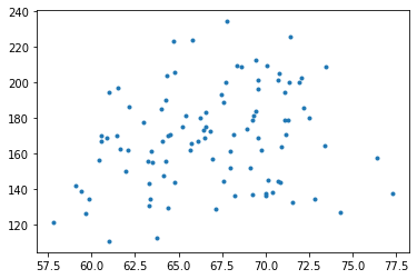
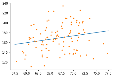
a = -0.18073773896209944andb = 186.0236653724885. Analyzing oura, or slope of fitted line, shows a small negative correlation between height and weight.Plotting our line $ax+b$ against our data we see:
The negative correlation is visualized as a downward sloping line against our point cloud. Broadly extrapolating from our sample data, this suggests that short people tend to be heavier than tall people.
@Ben - Nice story telling! I've used this program in Stat 185/225 a few times but yours is the first time I've wondered if I should double check my programming.
(Figured it would be easier to just make a new comment: To show my changes that you recommend):
Going off the boys previous work by plugging this in:
import pandas as pd df = pd.read_csv('https://www.marksmath.org/cgi-bin/random_data.csv? username=dan') df.tail() %matplotlib inline import matplotlib.pyplot as plt import numpy as np from scipy.linalg import solve, eigWhich produces this tale end of the tabel:
Importing a package to plot the data:
To consider all the data I made these changes:
import pandas as pd df = pd.read_csv('https://www.marksmath.org/cgi-bin/random_data.csv? username=dan') df.tail(99)Plotting all of the data:
Using the least squares method and provided code, a list of slopes and y-intersecpts can be analyzed and found to best fit tall of the data:
A = np.array([height, height**0]).transpose() b = np.array([weight]).transpose() a,b = solve(A.transpose().dot(A), A.transpose().dot(weight)) print(a) print(b) #Out: a = 1.7673603008572196 b = 51.52382533705932From here a best fit line can be plotted:
I started by importing the required libraries,
and then the data itself.
df = pd.read_csv('https://www.marksmath.org/cgi-bin/random_data.csv?username=frank') df.tail()Putting the data into vector form and plotting the data resulted in the following graph.
Using the least squares method, I created a matrix $A$ to hold the vector $h$ in the first column, and a column of ones in the second. Solving $A^{\text{T}}A\vec{x}=A^{\text{T}}\vec{w}$ resulted in values for $a\approx1.34$ and $b\approx83.4$.
Using the values of $a$ and $b$ in the function $f(x)=ax+b$ yields the line of best fit for the given data.
First, all of the necessary libraries are imported:
The next step of the assignment is to download the data collection so that it can be used in the script:
# Import data collection data = pd.read_csv('https://www.marksmath.org/cgi-bin/random_data.csv?username=joshuam') data.tail() # print(data.tail()) print(data.tail().to_html())Once the data is able to be manipulated, the height and weight values are extracted and plotted on a graph to display all of the data. This generated the following plot:
# Create variables to store the height and weight values from the collection
height = data.height
weight = data.weight
plt.xlabel('Height')
plt.ylabel('Weight')
plt.plot(height, weight, '.')
The next step is to determine the line of best fit for the data. This will be found by finding the solution to the system $ A^T A\vec{x} = A^Tb⃗ $ .
Running this code will calculate the slope and y-intercept for the line of best fit $ y = ax+b $
As a result, the line of best fit will be y = 1.284x + 80.093, where x represents height and y represents weight.
Using
import pandas as pd
df = pd.read_csv('https://www.marksmath.org/cgi-bin/random_data.csv?username=eli')
df.tail()
I got the tail of
Plotting Height vs Weight gave
additionally using
I got a= 0.27654818250610624 and b= 152.14317669408973
Therefore,
y= 0.28x + 152.14.
Furthermore, I used
to get the fit line