Examining Categorical Data
After learning the basics of data and examining numerical data a bit more closely, today we'll jump into a closer look at categorical data. This is mostly section 1.7 of our text, which is the last section that we'll do in chapter 1.
A little data
Let's start small today by taking a look at our class data:
| Gender | Age | Height | Eye Color | Major |
|---|---|---|---|---|
| f | 18 | 5.333333 | green | market |
| f | 18 | 5.083333 | brown | Bio |
| m | 31 | 6.250000 | brown | Acct |
| m | 20 | 6.583333 | blue | Comm |
| m | 31 | 6.166667 | blue | Mgmt |
| m | 20 | 5.750000 | hazel | Geo & Eco |
| m | 49 | 5.916667 | hazel | Mechatronics |
| f | 28 | 5.666667 | green | Anthro & Health |
| f | 22 | 5.583333 | brown | Psychology |
Recall that this comes from our class forum question; I updated our Scraping our class data demo to clean this up, too.
Frequency tables and bar plots
A simple way to get a handle on one categorical variable is through a frequency table. Here's the frequency table for Eye Color in this data frame:
| Green | Brown | Blue | Hazel |
|---|---|---|---|
| 2 | 3 | 2 | 2 |
Sometimes, it's easier to visualize this with a picture called a bar plot:
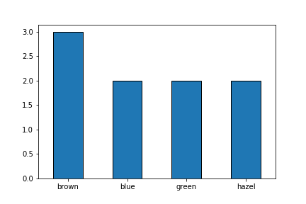
Note that bar plots look a lot like histograms but it's important to keep them distinct. A bar plot represents counts of categorical data while a histogram represents counts in some range of numerical data.
Contingency tables
If we'd like to explore any possible relationship between two categorical variables, we can use a contingency table. Here's the contingency table for gender and eye color:
| G\EC | blue | brown | green | hazel |
|---|---|---|---|---|
| f | 0 | 2 | 2 | 0 |
| m | 2 | 1 | 0 | 2 |
Often, it's useful to include row and column sums as margins:
| G\EC | blue | brown | green | hazel | All |
|---|---|---|---|---|---|
| f | 0 | 2 | 2 | 0 | 4 |
| m | 2 | 1 | 0 | 2 | 5 |
| All | 2 | 3 | 2 | 2 | 9 |
We could even use proportions, as we'll see in just a bit.
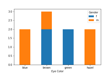
Stacked bar plots
We can expand the bar plot idea to account for and visualize two categorical variables. This is called a stacked bar plot:
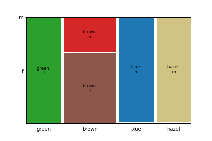
Mosaic plots
Another tools to visualize a pair of categorical variables that is more tightly tied to contingency tables is calles a mosaic plot:
A lotta data
Now let's examine the same stuff for a lot of data. We'll do so by applying Python to our CDC dataset.
Here's our basic imports:
%matplotlib inline
import pandas as pd
We'll compute a couple more special tools when we need them.
Getting the data
Recall that we can import our CDC data right off of the web:
df = pd.read_csv('https://www.marksmath.org/data/cdc.csv')
df.head()
A contingency table and bar plot
Here's how to generate a frequency table for the genhlth variable:
value_counts = df['genhlth'].value_counts()
value_counts
We can go straight from the value_counts to the corresponding bar plot:
value_counts.plot('bar', edgecolor='black', rot=0);

A contingency table
Pandas has a crosstab function designed specifically to generate a contingency table.
cont = pd.crosstab(df.genhlth, df.smoke100)
cont
You might want to reorder the rows, place the row and column sums in the margins, and/or indicate proportions, rather than counts:
cont = pd.crosstab(df.genhlth, df.smoke100, normalize=True, margins=True)
cont = cont.reindex(['excellent', 'very good', 'good', 'fair', 'poor', 'All'])
cont
It's very easy to generate a stacked bar chart directly from a contingency table.
cont = pd.crosstab(df.genhlth, df.smoke100)
cont = cont.reindex(['excellent', 'very good', 'good', 'fair', 'poor'])
cont.plot(kind='bar', stacked=True, rot=0, edgecolor='black');

There's also a function in the statsmodels library that makes it very easy to generate a mosaic plot:
from statsmodels.graphics.mosaicplot import mosaic
mosaic(df, ['genhlth', 'smoke100']);

It's actually quite tricky to reorder and style that result, though.
from seaborn import palplot, color_palette as pl

df2 = df[df.genhlth == 'excellent']
df2 = df2.append(df[df.genhlth == 'very good'])
df2 = df2.append(df[df.genhlth == 'good'])
df2 = df2.append(df[df.genhlth == 'fair'])
df2 = df2.append(df[df.genhlth == 'poor'])

def color(key):
    if key == ('excellent', '0'):
        return {'color': pl()[2]}
    elif key == ('excellent', '1'):
        return {'color': pl()[8]}
    elif key == ('very good', '0'):
        return {'color': pl()[0]}
    elif key == ('very good', '1'):
        return {'color': pl()[9]}
    elif key == ('good', '0'):
        return {'color': pl()[4]}
    elif key == ('good', '1'):
        return {'color': pl()[6]}
    elif key == ('fair', '0'):
        return {'color': pl()[1]}
    elif key == ('fair', '1'):
        return {'color': pl()[3]}
    elif key == ('poor', '1'):
        return {'color': pl()[7]}
    else:
        return {'color': 'gray'}

mosaic(df2, ['genhlth', 'smoke100'], gap=(0.02,0.02),
       properties=color, labelizer=lambda key: "");
