Stat 185 Intro
Statistics vs data science
Check out Wikipedia's article on Data Science. Quoting from that article, I guess that
- Data science is "The Sexiest Job of the 21st Century" (Wikipedia cites the Harvard Business Review)
- There could be a global shortage of 1.5 million data scientists (Wikipedia cites McKinsey & Company)
So... just what is this hot, new field?
- According to the same Wikipedia article, data science is a "concept to unify statistics, data analysis and their related methods" (Wikipedia cites a prominent text).
- According to page 8 of our textbook, "Statistics is the study of how best to collect, analyze, and draw conclusions from data".
- More blunlty, Nate Silver says that data science is "sexed-up term for statistics".
Why so hot?
Statistics (or data science, if you want) is hot for good reason. Data is becoming easier and easier to come by and it's impact more and more pervasive. Think
- Medicine
- Politics
- Sports
- Tech (Your car knows when you gain weight)
That's quite a variety of fields! Maybe that's why I recently stumbled on this article (written by a physician) asserting that statistics may be the most important class that you'll ever take.
What if I'm just an ordinary person?
What if you're not interested in being a techie or a doctor or anything like that? What if you just want to be an ordinary person?
You're extraordinary!
First off, if you complete your goal of obtaining a college degree, you're not exactly an "ordinary" person. By my estimates, barely 31% of US adults have a bachelor's degree or higher. Of course, only some fraction of those folks have taken a statistics class so, in a sense, you're already approaching the data elite!
Do you read the newspaper?
You really need some level of quantitative literacy in general and statistical literacy in particular to be an informed citizen these days. Politics these days provides all kinds of examples. Here are just a few examples:
- Elections predictions from FiveThirtyEight
- Gerrymandering
- Is immigration linked to crime?
- Health
- The NBA finals
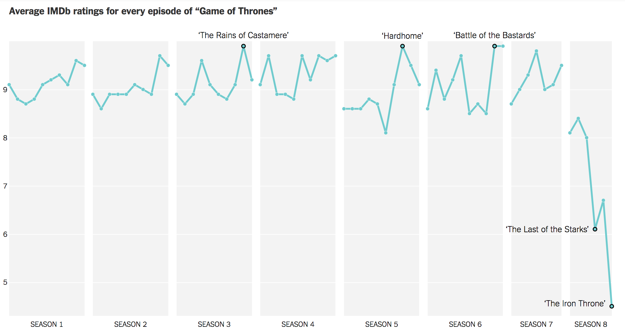
- GoT ratings
A look at some actual data
One major objective of this class to learn to deal with real world data. Here are two examples - one pretty basic and another more involved. Note that, as we go through these examples, we'll meet several important concepts from section 1.2 of our text whose title is Data Basics.
Percentage of folks with college degrees
Just a couple of paragraphs ago, I estimated that barely 31% of US adults had a bachelor's degree or higher. With what level of confidence can we assert that kind of estimate? Certainly, we can't check the educational status of absolutely every adult in the US!
These types of estimates are typically based on a survey. We select a subset (called a sample) of the whole population and perform the computation on the subset. We then extrapolate to the whole population based on the sample.
Data on educational attainment can be obtained from the Census Bureau. This particular data set is based on the Current Population Survey, a monthly survey of about 60000 households. If we take a look at that first file on that Census Bureau page, we see something that looks a bit like so:
| Total | None | 1st-4th | 5th-6th | 7th-8th | 9th | 10th | 11th | HighSchool | Some_college | AssociateOC | AssociateAC | Bachelor | Master | Prof | Doctoral | |
|---|---|---|---|---|---|---|---|---|---|---|---|---|---|---|---|---|
| 18+ | 246325 | 770 | 1555 | 3214 | 3648 | 3484 | 4267 | 10245 | 71170 | 46445 | 10081 | 13990 | 49368 | 20797 | 3196 | 4096 |
| 18-24 | 29404 | 53 | 64 | 80 | 182 | 231 | 604 | 3427 | 8658 | 10990 | 672 | 1088 | 3105 | 205 | 25 | 20 |
| 25-29 | 22745 | 18 | 71 | 114 | 172 | 224 | 351 | 761 | 6076 | 4462 | 918 | 1463 | 6028 | 1675 | 197 | 214 |
| 30-34 | 21505 | 51 | 78 | 208 | 238 | 298 | 277 | 620 | 5418 | 3680 | 893 | 1376 | 5356 | 2197 | 357 | 458 |
| 35-39 | 20773 | 53 | 102 | 325 | 280 | 385 | 306 | 623 | 5152 | 3209 | 914 | 1284 | 4984 | 2438 | 283 | 434 |
There are more rows but the first row is the key row for the question at hand. From there, we can simply compute the percentage by adding the amounts in the "Bachelor", "Master", "Prof", and "Doctoral" columns and dividing by the total number. Evaluating that computation on my computer, I get
p = (49368+20797+3196+4096)/246325
p
Just over 31%.
There's a lot more that we could ask about this! The main questions though are
- What can we infer about the whole population from this one computation and
- With what level of confidence can we make that inference?
Ultimately, we'll write down what we call a confidence interval for this estimate.
Describing some athletic data
The first step into statistics is to learn some basic descriptive statistics. Let's take that step with some data arising in baseball.
Anyone who follows baseball can tell you offensive output varies by defensive position; pitchers are so bad that their position could be considered an outlier. Let's look at some actual data to try to back this up.
Reading and looking at raw data
On my webspace, I have a data file containing batting statistics for all 1199 players in 2010. Let's take a look:
import pandas as pd
df = pd.read_csv('https://www.marksmath.org/data/mlbBat10.tsv', sep='\t')
df.head()
In the code above, we first import a library called Pandas that contains some great tools for the manipulation of data. In particular, it provides a Data Frame object that stores large data sets efficiently as well as tools to read data files into data frames - in this case, right off of the web. The resulting DataFrame has 1199 rows and 19 columns. The head method grabs just the first few rows.
The data has actually already been through quite a bit of formatting. Still, it's so huge that's quite a challenge to get a grip on it. Statistics provides tools (both qualitative and quantitative) to analyze large datasets like this.
A question
First, let's state a specific question we wish to address: How is on base percentage related to position?
Qualitative analysis
One way to visually investigate this question is with a side-by-side box plot.
%matplotlib inline
import seaborn as sns

df2 = df[(df['position'] != 'P') & (df['G'] > 75)]
pic = sns.catplot(
    kind='box', x='position', y='OBP', data=df2,
    aspect = 1.5
)

In this image, the positions are listed on the horizontal axis and the on base percentage is on the vertical axis. The data has actually been trimmed down quite a bit to include only those non-pitchers who played at least 75 games; there were 327 such players that year. If you understand how to read a box and whisker plot, you can see quite clearly the differences in on base percentage between the different positions
Quantitative analysis
While we can certainly see the differences between the positions in the box and whisker plots, it's nice to have definitive numbers to point to that support our analysis. For the analysis of the variance between several variables, there is a well established tool called ANOVA, for Analysis of Variance. Here's how to run ANOVA for this example:
import statsmodels.api as sm
from statsmodels.formula.api import ols

mod = ols('OBP ~ position',
                data=df2).fit()

aov_table = sm.stats.anova_lm(mod, typ=2)
aov_table
The "Pr(>F)" entry is an example of a $p$-value. As we will learn, these kinds of computations allow us to make inferences. Typically, a small $p$-value indicates a deviation from the status-quo. In this case, it indicates that the batting performances between the positions are not all the same.
The concepts we just met
These examples illustrate some important ideas from section 1.2 of our text on Data Basics. Let's summarize these basic but important concepts.
Data tables
The example data above are first introduced in tables. These are often called
- Data Tables,
- Data Matrices, or
- Data Frames (particularly in a computational setting).
Each row in a data table is called an observation and corresponds to a case in our study. Each column corresponds to a variable or characteristic associated with the cases.
For example, the second row in our data table for baseball players forms our observation of Derek Jeter. The 'position' column tells us that he was a Short Stop and the 'AVG' column tells us that his batting average was 270.
Types of data
There are two main types of data and both types can be further classified into two sub-types.
- Numerical data, which can be
- Discrete or
- Continuous
- Categorical data, which can be
- Nominal or
- Ordinal
If you take a look at our baseball data above, you can see numerical data of both types as well as Nominal, Categorical data. An example of Ordinal, Categorical data might be the player's jersey number. It looks numeric but there's really no reasonable computation that can be done with it.