A look at some actual data
One major objective of this class to learn to deal with real world data. So let's start by taking a look at our class data.
Note that, as we go through these examples, we'll meet several important concepts from section 1.2 of our text whose title is Data Basics.
Getting and examining the data
I've collected the results of our class survey and stored the result in a data table. There are 38 folks enrolled and the last few lines look something like so:
That's actual data, though I've set everyone's hometown to Asheville for privacy purposes.
Data tables
The result of our import is called a data table or data frame.
Each row in a data table is called an observation and corresponds to a case in our study. In this particular example, each case corresponds to a student enrolled in the class.
Each column corresponds to a variable or characteristic associated with the cases.
Types of data
There are two main types of data and both types can be further classified into two sub-types.
- Numerical data, which can be
- Discrete or
- Continuous
- Categorical data, which can be
- Nominal or
- Ordinal
Illustrations of numerical data
Histograms
A histogram partitions the horizontal axis into intervals and places a rectangle over each interval indicating a count of values. Here's a rough histogram of the heights of folks in the class. The dashed yellow line at about 5.64 is a quantification of location called the mean.

Another histogram
Here's a histogram for the ages in the class. The shape is quite different and the mean is, perhaps, less meaningful.

Box plots for numerical data
Alernatively, we might look at box plots fore these same variables. These illustrate the so-called five-point summary of
min, 1st quartile, median, 3rd quartile, and max.

Comparing numerical variables
Sometimes we'll want to find if there's a relationship between two variables. In the following side-by-side boxplot, we examine how the relationship between gender and height.

Illustrations of categorical data
Like a histogram, a bar chart represents value counts with vertical bars. Here's a bar chart for the different eye colors in the class:

The same bar chart
A key difference between a bar chart and a histogram is that a bar chart represents categorical data. So, for example, the order of the bars doesn't really matter. Here's a bar chart for the same data, the variables are sorted in ascending order, rather than alphabetically:

A pie chart
Lots of people seem to love pie charts for categorical data. I only favor pie charts when comparing two values of a categorical variable. In our data - section, gender or handedness are logical choices to illustrate with a pie chart. You get a good sense of relative magnitude or proportion.

A bad pie chart
While people do love pie charts, there's really no way to tell absolute magnitude and they can be confusing for data sets of moderate size. Here's a pie chart for the majors in the class:

Another bar chart
An better way to look at categorical data is with a bar chart, which makes it much easier to compare two values that are quite close to one another. We can also indicate magnitude with a single scale.

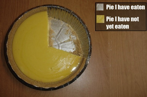
The last piece of pie
Again, pie chart's should only be used when comparing complementary proportions!
Geographic data
Geographic data is of tremendous importance and is often best illustrated on a map. Here's what the actual answers to the hometown question looks like:
The objectives of Statistics
One simple characterization of statistics is
the study of how to collect, analyze, and draw conclusions from data.
Note the three parts:
- Collect: Using experiments or observational studies,
- Analyze:
- Qualitatively - often using graphs
- Quantitatively - often using computations from probability theory
- Draw conclusions: The process of inference
Collecting data
Collecting data often boils down to designing an experiment or observational study. We'll talk a lot more about that in sections 1.3 and 1.4 from our textbook next time.
Analyzing data
The images we've seen today allow us to draw rough qualitative conclusions about the data we see. Quantiative analysis is more numerical. For example, 5 out of the 38 people in the class are left handed, or about 13.9%.
This is more precise information than we could glean from a pie chart.
Inference
Ultimately, we want to draw inferences or conclusions from data. To do so, it helps to have a little terminology:
- Population refers to the complete set of entities under consideration,
- Sample refers to some subset of the population,
- Parameter refers to some summary characteristic of the population, and
- Statistic refers to some summary characteristic computed from a sample.
The main question is: once you've computed a statistic from a sample, what might that tell you about the corresponding parameter for the whole population?
For example, I guess that about 13.9% of our class is left handed. We could take that as an approximation to the number of left handed folks in the whole population. How accurate an approximation might we expect that to be?