Web scraping for basic data
One way to get data these days is via web scraping. That is, you write a computer program that automatically traverses a specific set of web pages that you know contain some type of data that you want. Your program needs to download these pages, parse them, and output a file with the data in some palatable format. This is quite common for sports data because so many news sites present scores and other statistics in a tabular format.
The format of our data
Let's use this technique to gather the data from our personal data exercise. Recall that you entered the data in a somewhat specific format. For my daughter Audrey's entry, it looked like so:
|Gender|Age|Height|Eye Color|Major|
|---|---|---|---|---|
|f|9|4’ 0’’|Hazel|general studies|
You can read a bit more about typing tables in this post. Ultimately, though, this is not what our web scraper will actually see because the forum software reformats it to look like so:
<table>
  <thead>
    <tr>
      <th>Gender</th> <th>Age</th> <th>Height</th> <th>Eye Color</th> <th>Major</th>
    </tr>
  </thead>
  <tbody>
    <tr>
     <td>f</td> <td>8</td> <td>4’2’’</td> <td>Hazel</td> <td>general studies</td>
    </tr>
  </tbody>
</table>
This kind of code is called HTML and is exactly what your web browser needs to see to know how to format your input into a table. It also just so happens that there is are Python functions that can parse this kind of info directly to a Data Frame.
Reading and manipulating data
There is an awesome Python library called Pandas that contains some very powerful functions to read, manipulate, visualize, and perform some basic analysis with data. Using Pandas, it's just a few lines of code to read all the data we've got on our personal data page into a well formatted data frame. Here's how:
import pandas as pd
d = pd.read_html('https://mathstat.hwdiscuss.com/t/some-personal-data/45')
df = pd.concat(d[2:])
df
Very nice! We do still need to do a little manipulation with this. If we want to do computations with the heights, for example, we'll need to translate we'll need to translate the ft' in'' format into floating point numbers. For example, 5' 6'' should be $5.5$. Thus, let's write a height_to_decmila function that accepts a f' in'' string and returns the corresponding decimal. We'll apply that to everything in the Height column and use the result to redefine the Height column. While we're at it, let's delete the four foot tall person who's not actually a UNCA student.
def height_to_decimal(s):
    f,i = s.split("’")[:2]
    return float(f) + float(i)/12
numeric_heights = df['Height'].apply(height_to_decimal)
df['Height'] = numeric_heights
df = df[df['Height'] > 4]
df
Great! A couple more little things. Let's standardize the Gender names by consistently using lower case and use short names for the Majors.
def standardize(s):
    s2 = s.lower()
    if s2 == 'applied math' or s2 == 'math':
        return 'Math'
    elif s2 == 'computer science':
        return 'CS'
    elif s2 == 'engineering':
        return 'Eng'
    elif s2 == 'mechatronics':
        return 'Mech'
    else:
        return s2
for v in ['Gender', 'Eye Color', 'Major']:
    df[v] = df[v].apply(standardize)
df
Visualization and basic computation
Now that we've got some reasonably formatted data, let's do something with it! Let's start with simple plots of the heights in the class. Note that height is a numerical variable; a box plot or histogram might both be appropriate.
%matplotlib inline
df.boxplot(column='Height', grid=False, vert=False);

df['Height'].hist(grid=False, edgecolor='black');

These figures are tied to some of the summary statistics we see here and will talk about soon:
df['Height'].describe()
Now, how about a look at a categorical variable - like Major. A common visualization tool here might be a bar plot.
df['Major'].value_counts().plot.bar(rot=0);

Well, that really tells us something about the class!
Lots of folks like to use pie charts for this sort of thing as well:
df['Major'].value_counts().plot.pie(figsize=(6,6));

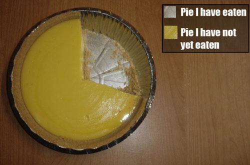
Frankly, I think a pie chart is almost always an awful idea! It's much harder to tell relative sizes on a pie chart than it is on a bar chart and absolute scale is impossible without simply labelling each slice individually. On a bar chart, a single vertical axis sufficiently gives a sense of the scale of all pieces.
Here's the only time that a pie chart is OK:
source